
Cultivating a winery brand is not just about getting one label correct—it’s easy in a start-up wine company when everything is focused on a single product. Yet the true creative endeavor comes with expansion, multiple varietals, vintages, or price points are the next step. When you walk into a wine store and observe the most financially successful brands, you’ll note that the majority operate with a visual consistency across everything they sell, even if each wine serves a different need or consumer. This does not occur by happenstance.
Table of Contents
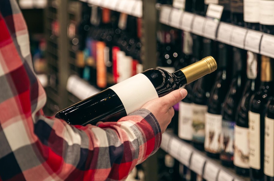
The Recognition Flaw For Many Wineries
When one product becomes a winery’s first release, all attention goes to it. Countless renditions of labels are developed, painstaking measures are taken to select a proper bottle that best fits the product’s disposition, and everything is critically observed. Enter wine number two. Now there’s a decision to be made. Should it look the same as the first one, or should it look entirely different? Most budding wineries have not struck that balance and therefore have visual branding that either all looks the same (boring) or each label looks completely different (confusing).
The consequence of recognition occurs in retail. Someone buys a bottle and loves it. They try to buy another from that winery but can’t find it because nothing suggests they’re from the same producer, or even worse, they all look so similar that the consumer can’t tell what’s what without reading the fine print. Each scenario undermines sales but it’s easily avoidable if a solution is adopted. This is compounded by the inventory on the shelves of many other wineries who get this branding right.
What Does Visual Consistency Even Mean?
Here, we’re not talking about keeping every look the same except for the varietal. That’s lazy branding and an assumption that consumers cannot manage variated appeal. Instead, visual consistency means that there’s a family resemblance where each label has its own personality but a bond among them exists.
Think of how family members rarely look alike 100% but there’s usually something recognizable as blood relation, whether it’s the eyes, the nose, or how they carry themselves. The same notion occurs with wine brands. The successful ones identify their core visual strengths and apply them uniformly while changing as much as they see fit.
These strengths typically include typography choices, color choices, label shapes and sizes, and finishing works. For example, a winery may use the same typeface for their branding across every bottle but employ differentiating accent colors by varietal. Alternatively, they may keep label sizes true while differencing background colors and images based on what works. The idea is to learn what can stay the same and what can flex.
Where Technical Consistency Comes To Play
Visual consistency requires technical consistency, and this is the failing part for many wineries that get it wrong. For example, a bottle that looks right in round one may look different from a second run due to lack of production standards in place to keep things the same. Color shifts occur, paper weights, finishing differences, the small things that no one thinks about become problematic since over time, they make labels look inconsistent.
Once a winery moves beyond single-product status, producing labels with a trusted wine label printer is crucial. The ability to replicate color through multiple runs, ensure quality of material and level of applications provide a major difference between cohesion and related but not quite there sentiments.
This is even more apparent when a winery produces tiered wines at varying price levels. Some wineries assume they can cheap out on label printing for entry-level yet nice out for reserve. But that’s detrimental to the brand building effort because customers need to recognize visual appeal regardless.
Flexible Approaches To Your System
The best systems anticipate change. Wineries must release new vintages yearly, they host special releases, they dip their toes into limited release efforts, and they sometimes cancel efforts when something isn’t selling. This means that a system is only as good as its allowability for flexibility without sacrificing sensibility.
A smart winery builds this type of flexibility into its design choices. They pick color palettes with enough range that allow differentiation for varietals but not so much variation where it comes off as chaotic. They select typographical choices that work across various spaces (fancy for reserve, downplayed for everyday choices) and modular systems where certain aspects remain fixed while certain choices can be tweaked depending upon product.
Flexible growth extends to production. If a winery has reliable sources that can handle standardized runs (thousands) and small-scale runs (500), then new efforts can be tested without concern over lack of quality feasibility. Limited runs should possess the same label quality as runs five times their size, but only if systems allow for change without limited aesthetics.
The Price Point Problem
Managing tiered visuals across various price points pose unique issues, as in the difference between a $15 wine and a $60 wine while still making it clear they’re related products. Quality premium customers expect premium packaging, but this is not to assume low-end customers will glean value if their limited expectation may make them feel bad about their purchase.
Successful wineries navigate these waters with hierarchies. The base elements remain steady but their designs receive additional features at the cost of their tier. Embossing or foil stamped features for reserves while keeping standardized releases simpler is effective. These ideas must never convey hierarchal differences; they should always feel like an enhancement as part of the same family.
Things like materials matter too. Paper weight, finish quality and print level all matter to perceived value. Cutting corners for low-budget labels makes them feel like off-brands for less expensive companies, which diminishes equity built with pricier options or confuses consumers about what the brand stands for.
Established Brands Teach Us How
There are plenty of wineries who’ve upheld their visual brand recognition for decades. Thus, we learn from examples that show us how they cultivate these systems through changing trends over time, minoring refinements instead of major overhauls and consistent productions quality through printing to design.
Take vintage changes, the most common change any winery faces, and those who do it right keep everything else stable except for established years; consumers can see from across the room what brand it is and quickly approach to see which vintage it may be. That’s recognition, or lack thereof, at its best.
Time adds value to everything. Established brands champion time as their visual identity read from a distance cultivates what consumers assume about quality style over years. Loyalty builds not just with individual offerings but with brand perception that supports new additions later down the road, especially during bad years out of anyone’s control.
The Myth of Small Wineries
Do small wineries think visual consistency isn’t feasible for some time until growth later down the road? Absolutely not. It matters more when finances are scarce because resources must be leveraged properly yet impressions to valuable appeal matter more when visuals are limited across three wines that all look like they belong together than if they look hodgepodge.
It’s not necessarily an investment as much as it’s forethought and discipline. Maintaining decision making ability about what visual looks appeal most desirable under any circumstances operates above impulsive reaction to every label developed. All it takes is working with an effective supply partner who knows consistency through time means more than anything valuable aesthetics imaginable.
Visual consistency may seem easy across product line either theoretically or practically but in reality it’s far more difficult than anticipated unless educated approaches taken about brand realization support decisions about aesthetics versus implementation down the road. Those who do it right create valuable enterprises through visual appeal whatever might be purchased by consumers because history tells them so without uncertainty. Building this kind of recognition takes time, but the payoff comes in customer loyalty that extends beyond individual bottles to embrace the entire brand story being told across every product line.
Want to know more? Head over to our blog!